How to create a colour pallet for your brand

Colour is a powerful marketing tool that can evoke emotion, send messages and carry meaning about your brand. It helps give personality to your business. Colour is such a simple and effective way to connect with your customer and help make your branding memorable. It is theorised that colour can increase brand recognition by 80%.
Think about some big brands and how their brand colours come to mind. Consider Apple’s white apple icon. Steve Jobs chose white, a colour of purity to align with his vision of beautifully designed products. At that time grey was a dominant colour in the industry, so he chose white to stand out against the marketplace. Or, what about Cadbury’s regal purple, aka Pantone 2865c. You recognise the brand by the colour alone without even seeing the logo.

Image from Unsplash
“If people are familiar with your logo, colour becomes a short cut for conveying visual details about your brand”
Now we know how essential colour is for your brand. I’m here to take you through the steps I take to help my clients find the perfect pallet for their brand.
Step 1: Get clear on your brand’s core essence
Before you get started, you want to be clear on who your audience is and what your message is. For example, would you like to be seen as organic and ethical, or pure and modern, or strong and trustworthy? Are you trendy or timeless, affordable or high end, feminine or masculine, playful or serious, modern or classic, mature or youthful, loud or subdued? If you want help to get clear on defining your brand values check out my worksheet. Some key questions to ask yourself are:
Your Brand
What are the core values of your brand?
What matters to you and your business?
If your brand was a person, how would you describe their style?
If your brand was a person, how would you describe their personality?
Your Audience:
How do you want to make your audience feel when they interact with your brand?
Who is your audience and what is important to them?
What other brands are your audience drawn to?
Step 2: Explore colour psychology and find colours that align with your brand
Now that you have a clear understanding of the kind of message you want your brand to portray, it is a good idea to think about how you can use colour to communicate this message. Looking into colour theory, colours have associations and an understanding of these can be helpful when considering what you want to say. Some examples of colour psychology to understand what colours mean include:

Warm colours are bold, uplifting and energetic and cool colours convey a feeling of calm and reserve .
It is also important to keep in mind that the effect your branding colours have also depends on the style and design of your branding. The use of typography, illustration style and words used all have an impact on the branding too. The hue, shade, tint, and saturation all come into consideration as well.
Step 3: Research Inspiration & Competition
Now you might have a bit of an idea of the type of colours that may be symbolic of your brand. At this stage, I like to research inspirational imagery that evokes the feeling I am trying to achieve for the brand. Some good places to seek inspiration are Pinterest, Behance and Dribble. I usually create a mood board with images that express what I am trying to convey and pull colours from there to start getting a feel for the creative direction to build the colour pallet.
I also research the competition. I look at all the brands in the same marketplace and study what colours and branding aesthetic they have used. This is so important to make sure you stand out against your competitors. This ensures your brand is unique highlights your unique selling point. For example, if you are the only organic or eco-friendly product in the marketplace, you could go for natural earthy colours to be in contrast to the others.

Step 4: Experiment with Pallets
Now you will have a bit of an idea of the colours you love, the colours that will connect to your audience, and the colours to avoid, you can start playing about with the combinations. As a general rule, I usually choose 1 or 2 bold key colours, an accent colour, then 2 or three more neutral colours to complement and enhance the key colours. This allows flexibility with your colour pallet so it will work in a wide range of applications:
● Base: these are one or two bold key colours. These should reflect your brand’s key traits.
● Accent: This colour is used second to the base. It needs to work well with the base in a complementary or contrasting way. The accent needs to be interesting and visually appealing to you and your ideal customer.
● Neutrals: Follow up with two or three more neutral colours to complement and enhance your key colours. Typically, these are hues of greys, beiges, off whites and white. Black can also be used sparingly.
The neutral colours are meant for the most basic content, while the brighter colours and accents are for really important areas to highlight like buttons, or announcements. The contrast is attention grabbing and helps differentiate what is more, or less, important to the audience.
Step 5: Use brand colours across all touch points of your brand
Once you have chosen your pallet apply your brand colours across your whole brand to have a cohesive branding. Your brand colours should appear in your logo, your website, your social media platforms, your emails, business stationary, marketing, advertisements, uniforms, signage, instore, and at every aspect that the customer interacts with your brand. You want to be easily recognisable and cohesive. Brand guides are a good way to ensure consistent use of colour.

Brand guides usually outline:
A brand overview- values, mission statement, and personality of your brand.
Tone of Voice- The way you speak to customers or messages you want to communicate.
Logo treatment- The size it should appear or where it should appear on a page or email.
Colour palette- PMS, CMYK, RGB, and HEX.
Typography- For use in emails, print materials, or websites.
Image styles- Such as the photos, styles, colours you use on social media.
Design styles- For things like business cards or letterheads and how colour should be applied in these places.
Colour is such a simple yet effective method of communication, so it is worth spending the time to choose it carefully.
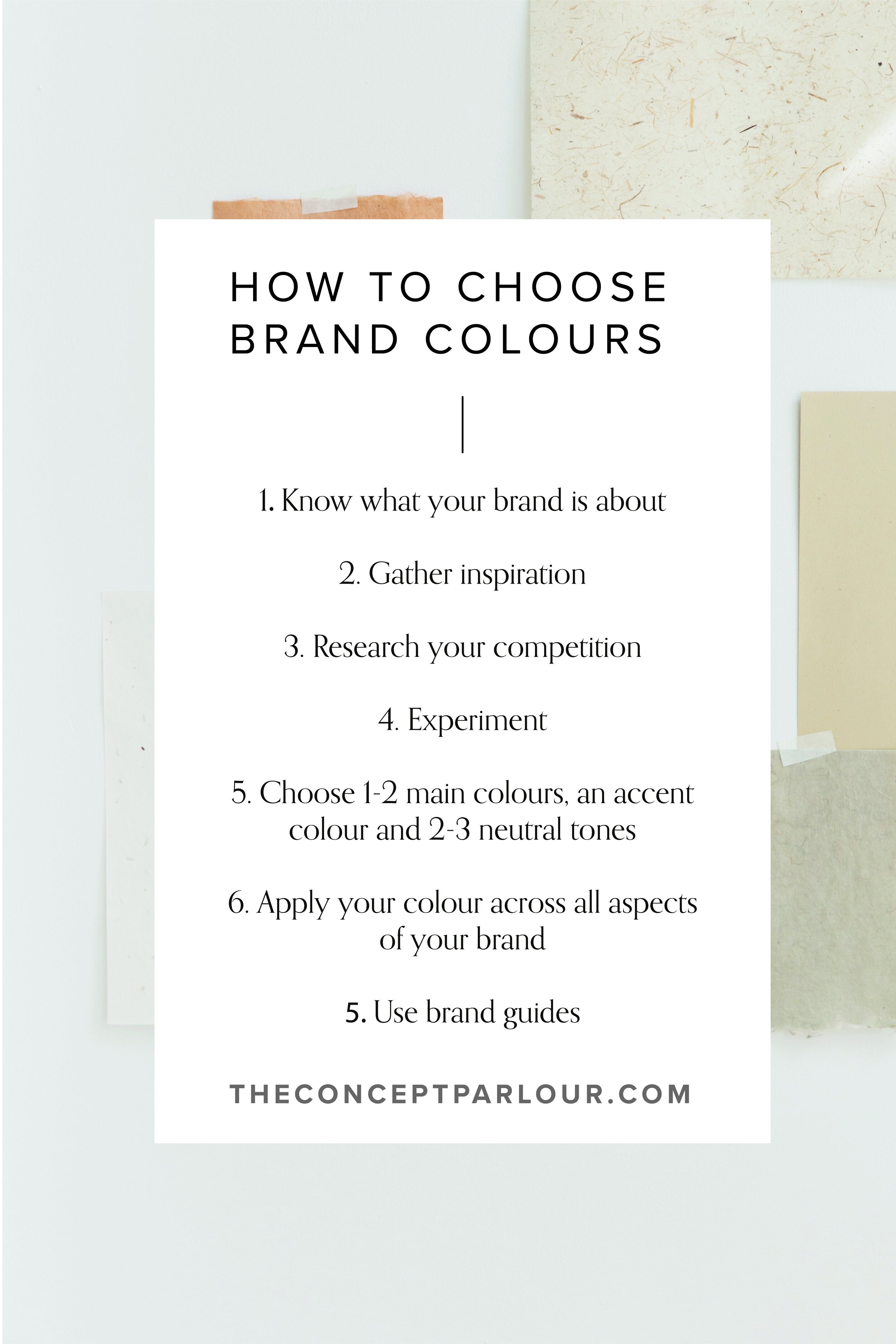
Overall, the key points to remember for choosing the right pallet for your brand:
● Know what your brand is about so you can align with colours that reflect that consider colour theory
● Gather inspiration and consider how these colours make you feel
● Research your competition and do something different
● Experiment and play with a range of different ideas – you can even test it out
● Have 1-2 main colours, an accent colour and 2/3 neutral tones
● Apply your colour across all aspects of your brand
● Use brand guides to ensure consistency
If you have any questions about colour pallets or would like some help putting together a cohesive brand identity with colours please get in touch for a chat.