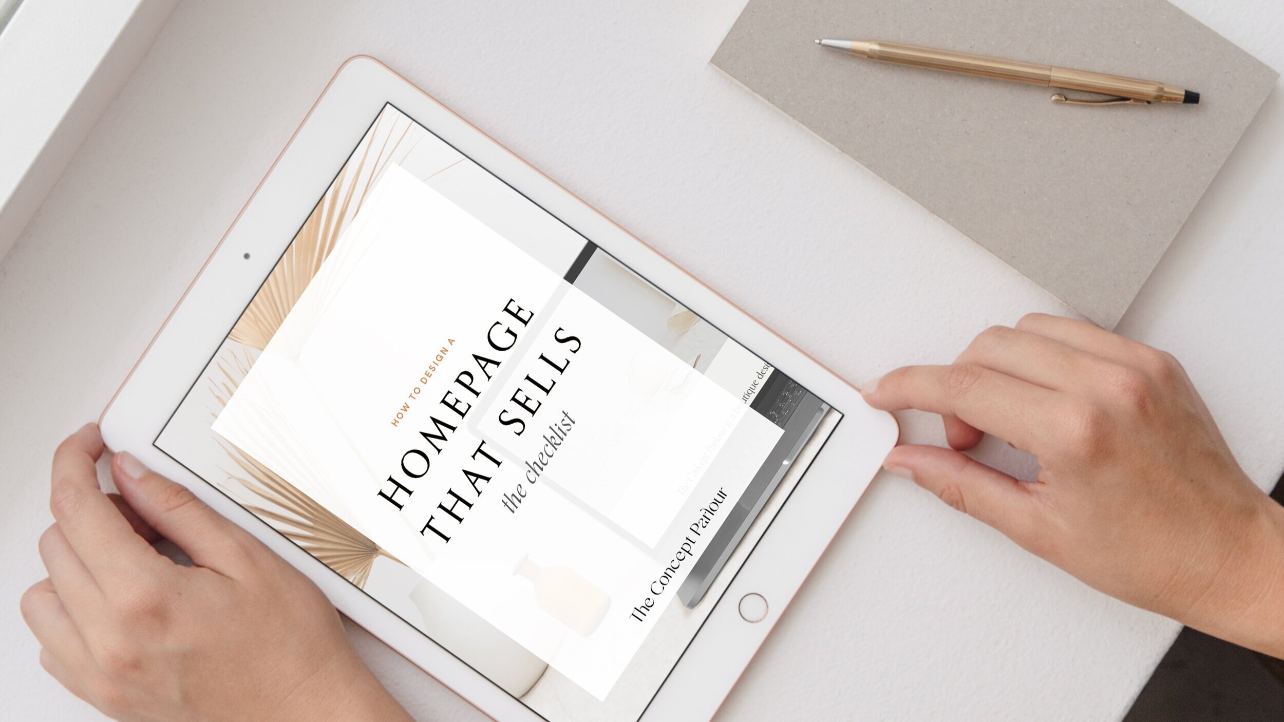
How to design a Homepage that Sells
It takes a user less than a second to decide whether or not they will stay on your website. A great homepage will make the right first impression with your potential customers, quickly introduce them to your product or service, and entice them to stay and explore further.
You want the site to not only look and function beautifully, but to guide the user through the site and to encourage them to take further action and connect with your brand.

To begin planning your strategic homepage you need to get clear on both the goal of your audience and of your own business. For example, your business goal might be to get people visiting your site to hire you or buy your products. However, your audience might be visiting your site to read your blog or download your free resources. Therefore, it is important that you consider what your audience wants, and then gently guide them to where you want them to be.
There isn’t a one-size-fits-all formula for the perfect homepage because every business is so different and has different goals. However, here is my basic framework that I begin every homepage with:
Above the fold (first thing you see at the top of your website)
Logo
This is a pretty obvious one. Your logo should be visible at the top of your website. It is your brand’s core identity. Also, your logo often works as a link back to the homepage, so you want it in an obvious location at the top of your homepage.

Navigation
The navigation menu should also be included in your header. It needs to be easy to locate and with clear headings that would make sense to a new visitor to your site. Think about what your user is most likely to want to access quickly on your site.
What, Who & How
Within a matter of seconds tell your audience if they are in the right place with a quick headline or a few lines of text explaining:
- What do you do/offer?
- Who do you do it for (the more specific the better)
- How does it help the user/what results, or benefits will they get?
Quick bullet points are a concise way to quickly describe what you do or the services you provide. Also, make sure your tone of voice is consistent for your brand and is simple and easy to read (without any industry specific jargon).
Call to Action
Encourage your audience to take action right away. Have a clear link or button to get them to the right place quickly. The goal of your homepage is to pique the viewers’ interest and to prompt them to delve deeper into your site. A call-to-action button (CTA) is a great way to pull them into your site and learn more about your brand and offerings. CTA buttons can link to contact forms, subscriptions, or any place where they can learn more or see more about what you have to offer.
Give them what they came for
Consider the main reason they came to your page. Was it to buy your products, services or view your work? Make sure you are giving your audience what they came onto this page to see. Then follow up with a CTA to gain more information – for example, view more work here or find out more.
Below the fold
Feature a service, brand or product
Reintroduce them to your best, most popular or newest offering. By showing them again what you offer you can prompt them to take action and familiarise them with your offerings. People feel more comfortable knowing what others like too, so they will feel more confident with their purchase knowing it is a good choice because others think the same. This brings me to my next point.
Testimonials
Social proofing builds trust and credibility. This can include testimonials, customer reviews, press features or simply just deeper insight into why your offering is going to be worth it. Success stories inspire positive first impressions and help new users gain trust and make them more likely to buy!
Connect them to your brand (a little about you).
People buy from people they know, like and trust. Show them the real people behind the brand. Let them into who you are, and show them that you have shared values. Give them a reason to connect with you and remember your brand. Strong visuals and photographs are an effective way to humanise and foster an emotional connection with your brand. Offer a CTA to learn more about you on your about page, or your social media.
Footer
Leave no dead ends. Once the user reaches the end of the homepage, the footer offers even more places for them to delve deeper into your brand. Your footer should offer more links (such as a mini sitemap, your contact information and social media integration (for example, an Instagram grid). You could also offer an incentive to join your mailing list to further encourage contact with your potential customers.
To summarise, an effective homepage:
Knows what your user wants from your site, and what you want to achieve from your site and guides the user so you both get what you both want to achieve.
Is short, simple, concise, simple and clean. (White space & bullet points are good!)
Includes quick call to action (with the user in mind).
Connects your audience to your brand via more touch points to learn about you and to engage with your brand beyond the homepage.
Leaves no dead ends.

Ready to get started on your own homepage?
If you want to learn more about my website design process please get in touch and we can help you design a website that will engage and convert your audience into loyal customers.
Ella x